How to add meaning to your CJM by using visual materials, colors, and even emojis.
Who wouldn’t want to get into other people’s minds once in a while? Especially if those other people are customers and you are a seller or service provider. Since it’s not OK to grab your customer by the sleeve and demand them to tell all, we are lucky to have a methodology called customer journey mapping.
In essence, customer journey maps (CJMs) are made to visualize the customer’s path from initial thought all the way to action and make this visualization clear and understandable.
Unfortunately, it’s not always the case. Sometimes the CJMs are presented as a dry and boring spreadsheet full of words that are supposed to paint the picture. Instead of just showing the actual picture.
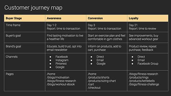
Source: Shopify
Our brain is just not trained to process text fast, we need time. Pictures, on the other hand, are highly comprehensible. According to John Medina’s Rule #10 from his bestseller Brain Rules, information is better absorbed when presented visually.
So, what are the tricks of transforming data into a pleasant and easy-to-grasp presentation? How can one make his CJM research colorful, clear, and convincing?
Paint the picture
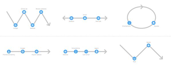
By showing some creativity while visualizing a customer journey stage, you can improve CJM quality. Instead of writing a detailed description with dozens of words to read, just add a picture to the block of text. A visual component will accentuate the meaning instead of spreading it all over those three sentences you need to describe the action. It will clear out the air.
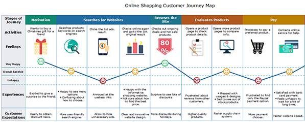
Source: edraw
Think of it this way: your essay on how you spent your vacation is not nearly as engaging as a picture of you in a hammock holding a fruity drink.
“The guy walks into a bar and asks for a drink” is better left to opening a bad joke. You can just add a picture of a guy at the bar. Depending on the specifics of the actual business, it can be a real-life picture of the shop, or a screenshot of an online store, or even a stick figure. Anything will be more alive than a scrupulous description.
You can create a whole storyboard section with actual customer actions to show a complete sequence of events. This way you won’t need to waste your space by filling it with text: pictures are self-explanatory.
There are very few tiny formats more engaging than comics. So why not put your essential data into a plain and consistent visual representation of real-life situations?
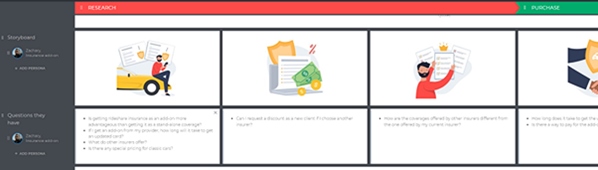
Source: UXPressia
Make whoever sees your CJM feel as if they were present at every stage of your customer’s journey.
Show some emotion
The reason we are so persistent in using emojis is simple: they express our feelings better than our own words.
Make a persona come to life in your CJM by showing their emotions throughout the journey. Customer experience is directly based on the emotional part of it. Putting an emoji instead of describing the customer’s attitude is a powerful tool: it basically gets us into empathy mode and allows us to take every interaction more personally.
Exactly the result we hope to achieve by building a CJM in the first place.
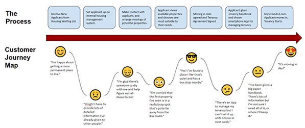
Source: Technology Meets Culture
Our most basic cultural code fills us with joy when we see a smile. And that’s how you can put “emotional” back into the “emotional journey”.
Picture channels and process
Don’t forget to visualize your persona’s channels and processes. Showing the type of the process is necessary to shine out the customer’s path through separate interactions.
- For the Linear process. Is it as direct as you were hoping it to be?
- For the Non-linear. Does it allow the customer to browse and stroll around freely?
- And for the Cyclical process. Is the repetitive part also time-consuming?
Source: UXPressia
Simple lines and circles offer a good representation of the most complex ideas, so why not add some basic geometry to your CJM.
This might show any unnecessary detours and repetitive actions your customers have to take every time they come to you.
Don’t hesitate to use visuals in describing the channels. It will work even better when there are many of those: repetitive words like “phone” and “Instagram” are overloading your map without much use.
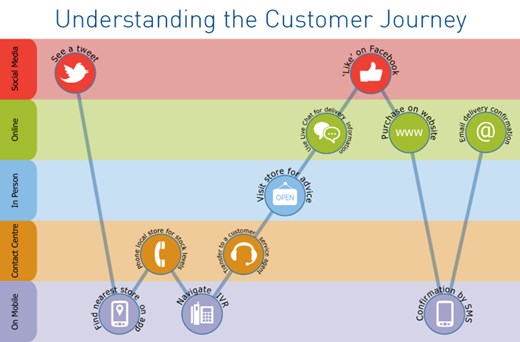
Source: Ephlux
Present the people
The ultimate way to create an engaging map is to make it as realistic as possible. By adding interactions of your persona with others, you can give a whole new dimension to your CJM. After all, in real life customers are interacting not with an abstract business but with people in and around the actual business. And those interactions may play a crucial part in their journey: we can be easily bummed out by a chatty hairdresser or pleased by a standard greeting. And this variable is worthy of presenting.
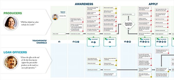
Source: GSA
In general, life-like interactions are proven to be very engaging and relatable. Just ask anyone who’s still watching the Days of Our Lives.
Hit the charts
As mentioned before, geometry is a great aid to putting things in order. By triggering our ability to think in abstracts, a simple chart makes all the difference while presenting numbers.
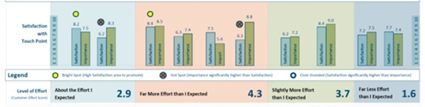
Source: Usability Geek
The human brain has an intuitive understanding of sizes, shapes, and colors which allows you to put complex numbers in plain and logical packages. Arrows climbing and descending, bigger parts of a circular “pie” and neighboring columns – those symbolic images need no translation and instantly add transparency to numbers in your CJM.
Add a splash of color
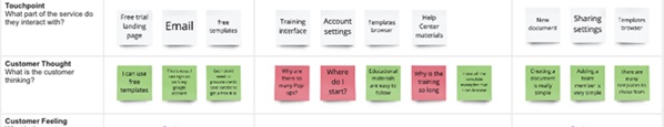
The shapes are followed by the colors: another conspicuous way to tell things apart at first glance. Green light – red light. By color-coding your CJM you emphasize the good, the bad, the dangerous, and the rewarding.
Nothing says “we have a serious problem” better than the fiery red customer journey layout. It calls for action and demands to take measures that would relieve the pressure to the peaceful green level.
Source: Miro
Yellow can be used for those sections needing attention, as this color is a commonly known warning.
Keep it together
When presenting your CJM, it’s essential to make it informative and catchy, simple yet full of detail – in other words, to keep the balance. Not too flashy, not too dry. Just right.
By using all the means of expression mentioned, you can create a crucial piece of business analytics in a way it will be “speaking” to your audience.
Hopefully, it will be full of green color, growth charts, and smiley faces.
About the Author
 Tanya Levdikova is the Head of Content @ UXPressia. When she is not working on content-related stuff for UXPressia users and blog readers, she’s probably petting her cat, baking cheesecakes, rewatching Doctor Who, or walking somewhere outdoors with loud music in her earbuds.